_Diagram workflow
Microsoft Assessments
View final diagram︎︎︎
Initial concept notes and reference images for the diagram.
Early diagram sketches. The background was a wireframe of some 3D geometry that I converted to SVG format.
Originally I started with a hexagon shape, which didn’t convey the flow of the assessment steps well. A circular shape visually conveyed a more seamless ease of use.
Originally I started with a hexagon shape, which didn’t convey the flow of the assessment steps well. A circular shape visually conveyed a more seamless ease of use.
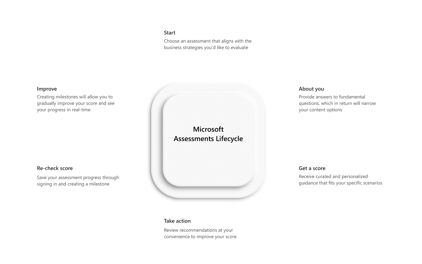
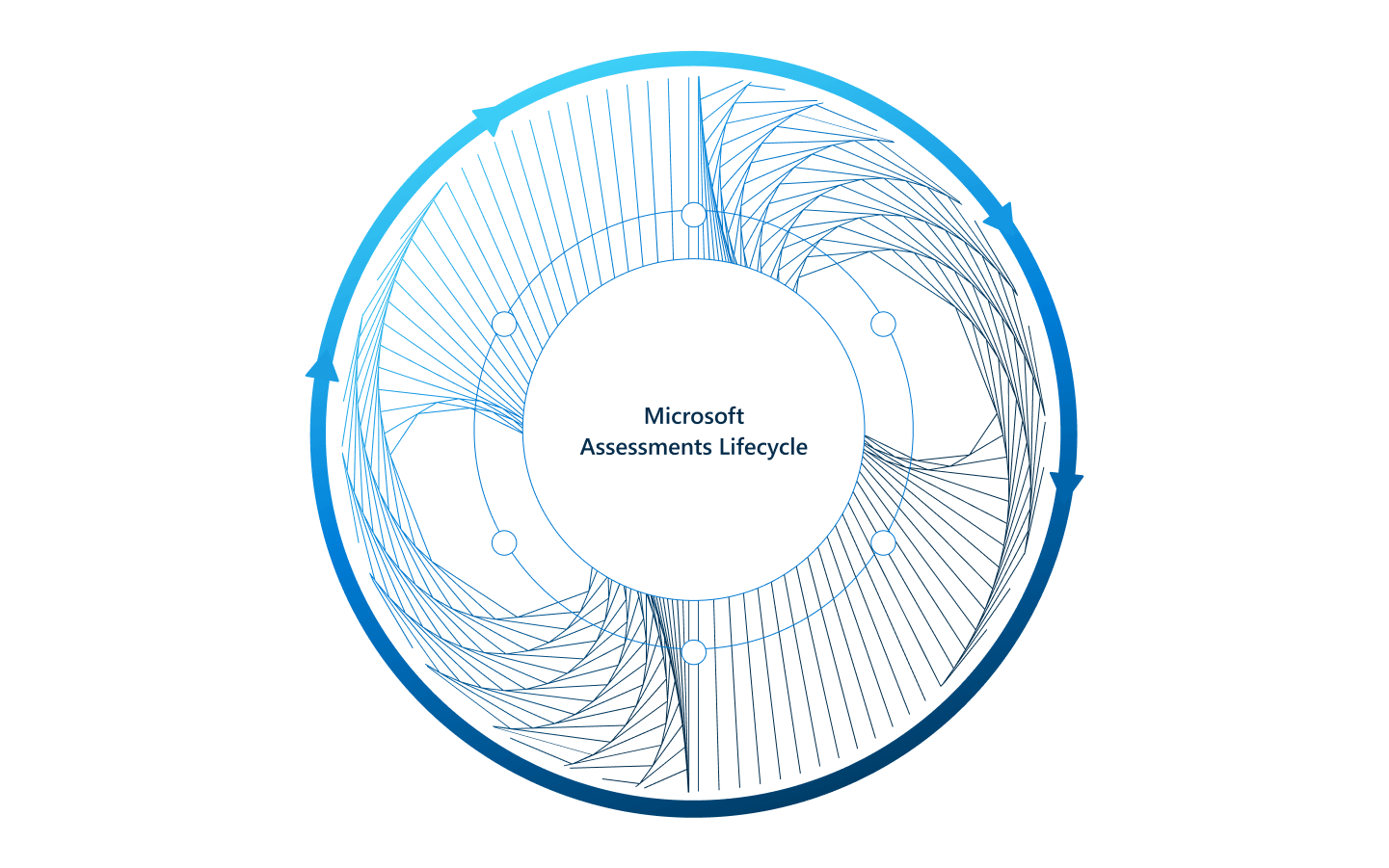
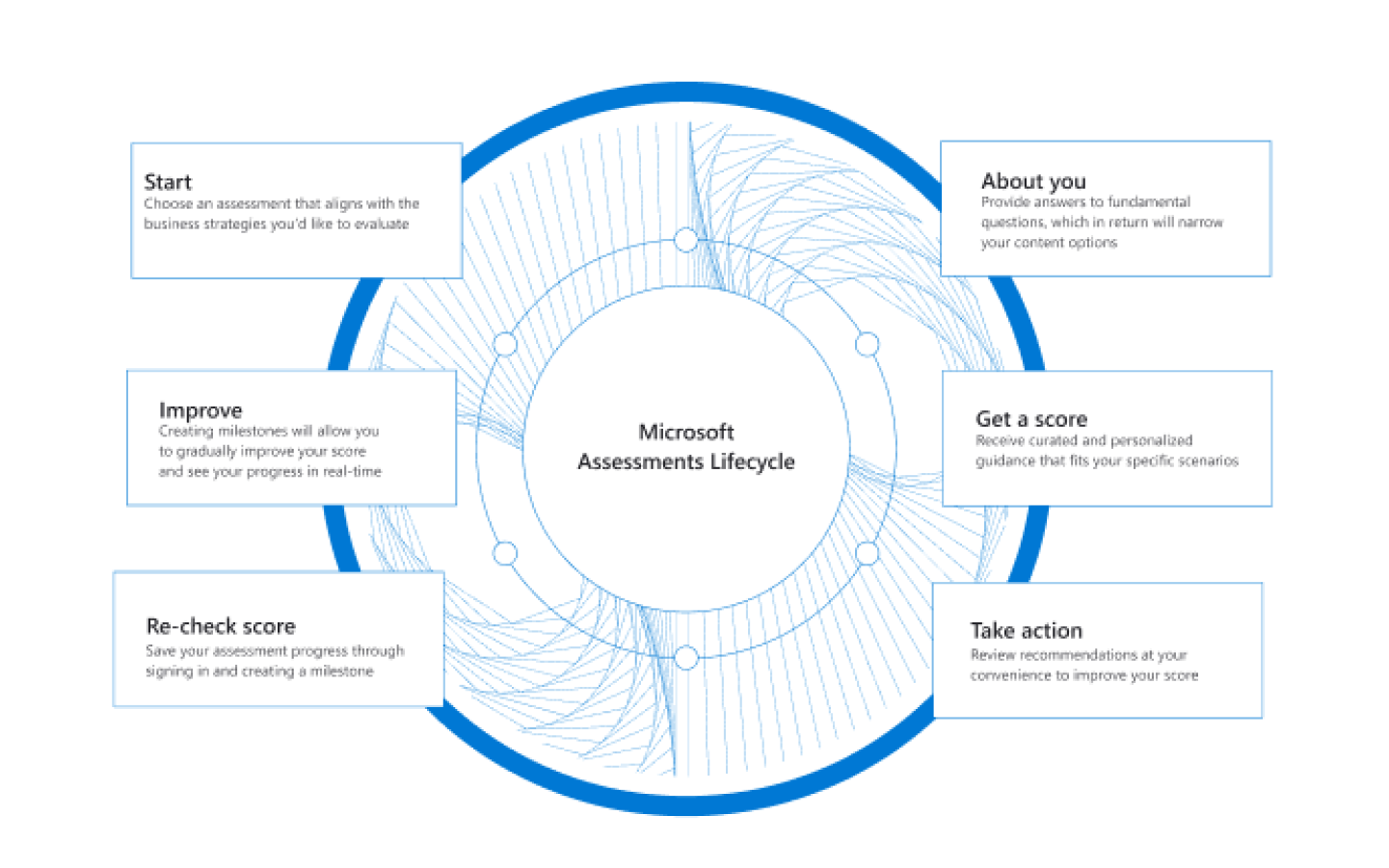
Initial finalized image.
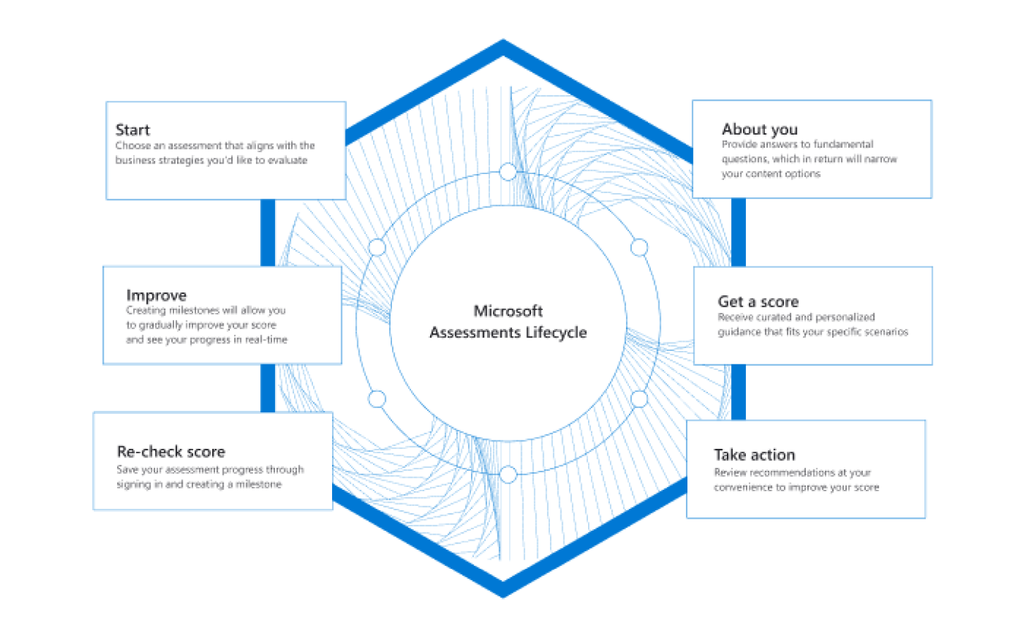
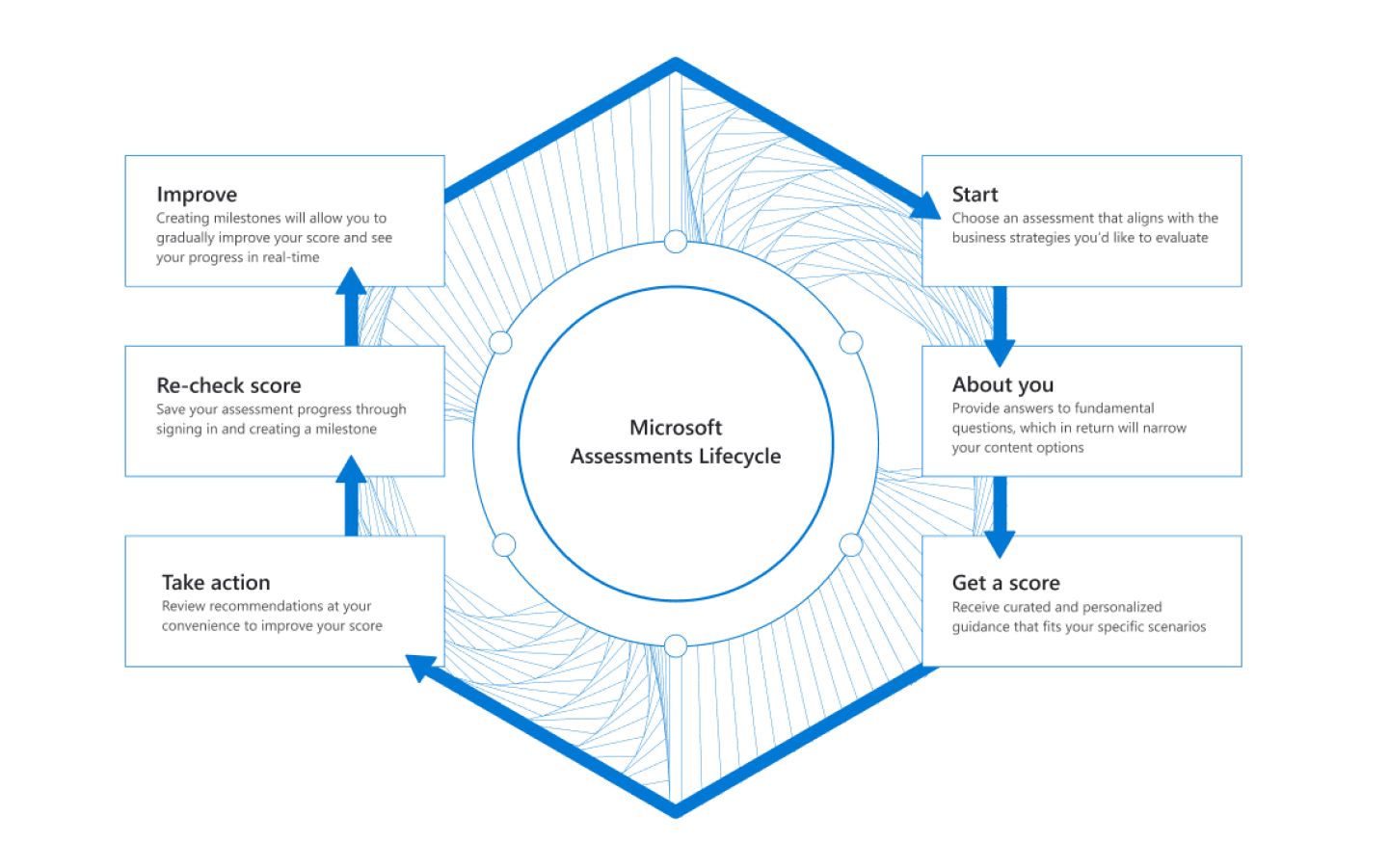
While it is a visually striking diagram, it did not translate well to mobile format.
While it is a visually striking diagram, it did not translate well to mobile format.
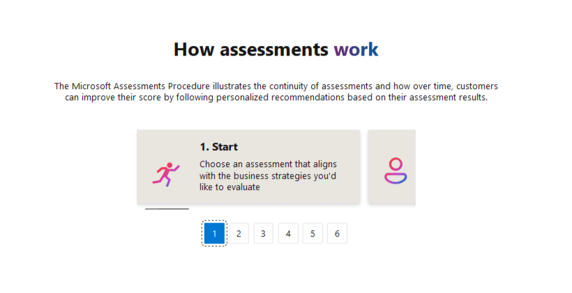
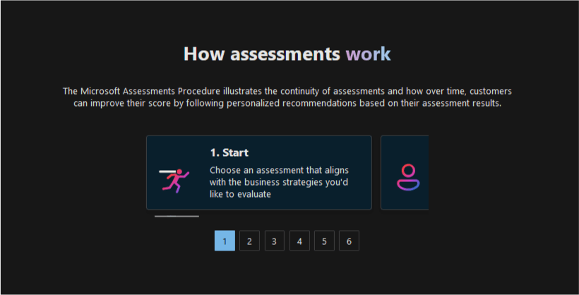
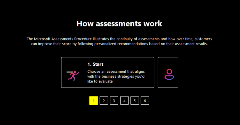
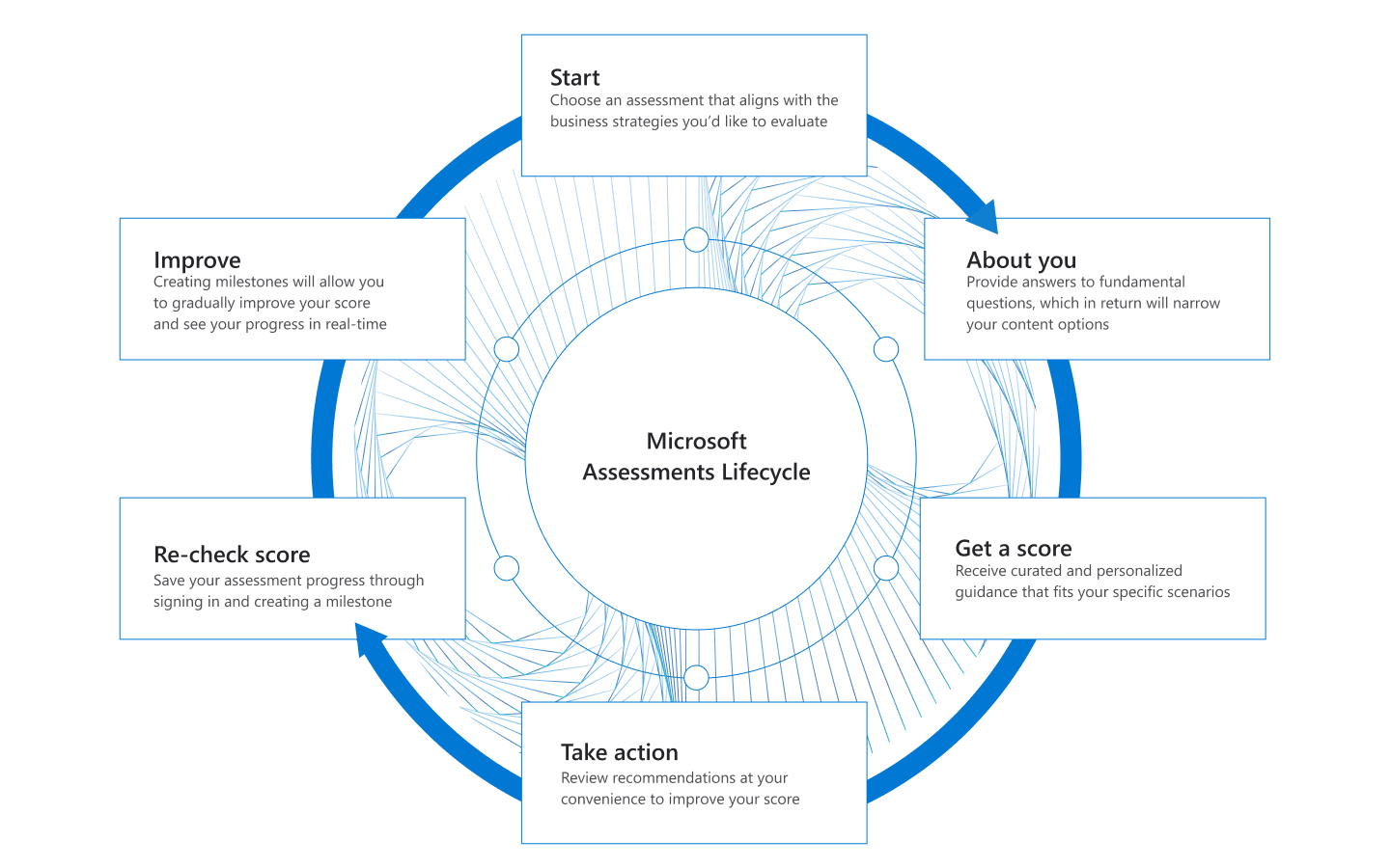
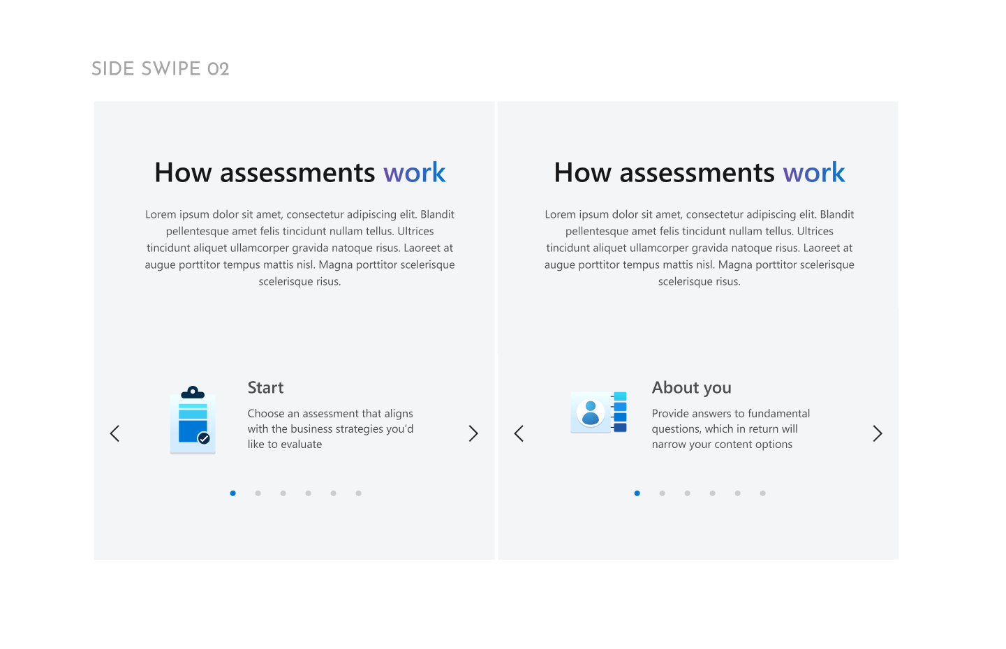
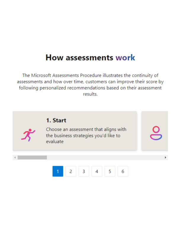
The diagram information is cyclical in nature, so for mobile we decided to utilize a carousel to show each assessment step.
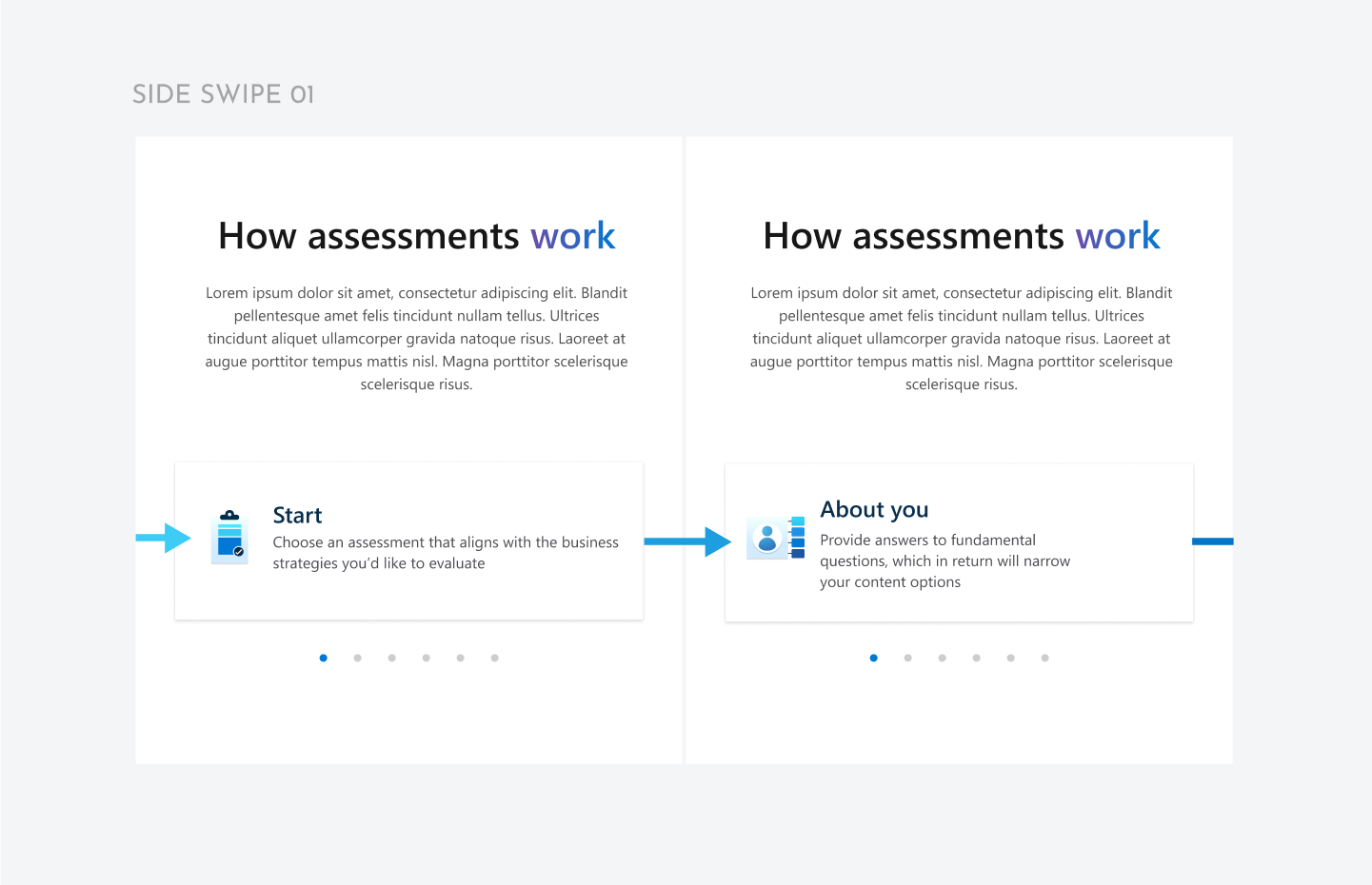
The diagram was reworked to be built in code, using the initial cards from the original image as a starting point.
This change made it assessible to screenreaders, easy to text edit, responsive, and easy to convert for localization.
The diagram was reworked to be built in code, using the initial cards from the original image as a starting point.
This change made it assessible to screenreaders, easy to text edit, responsive, and easy to convert for localization.
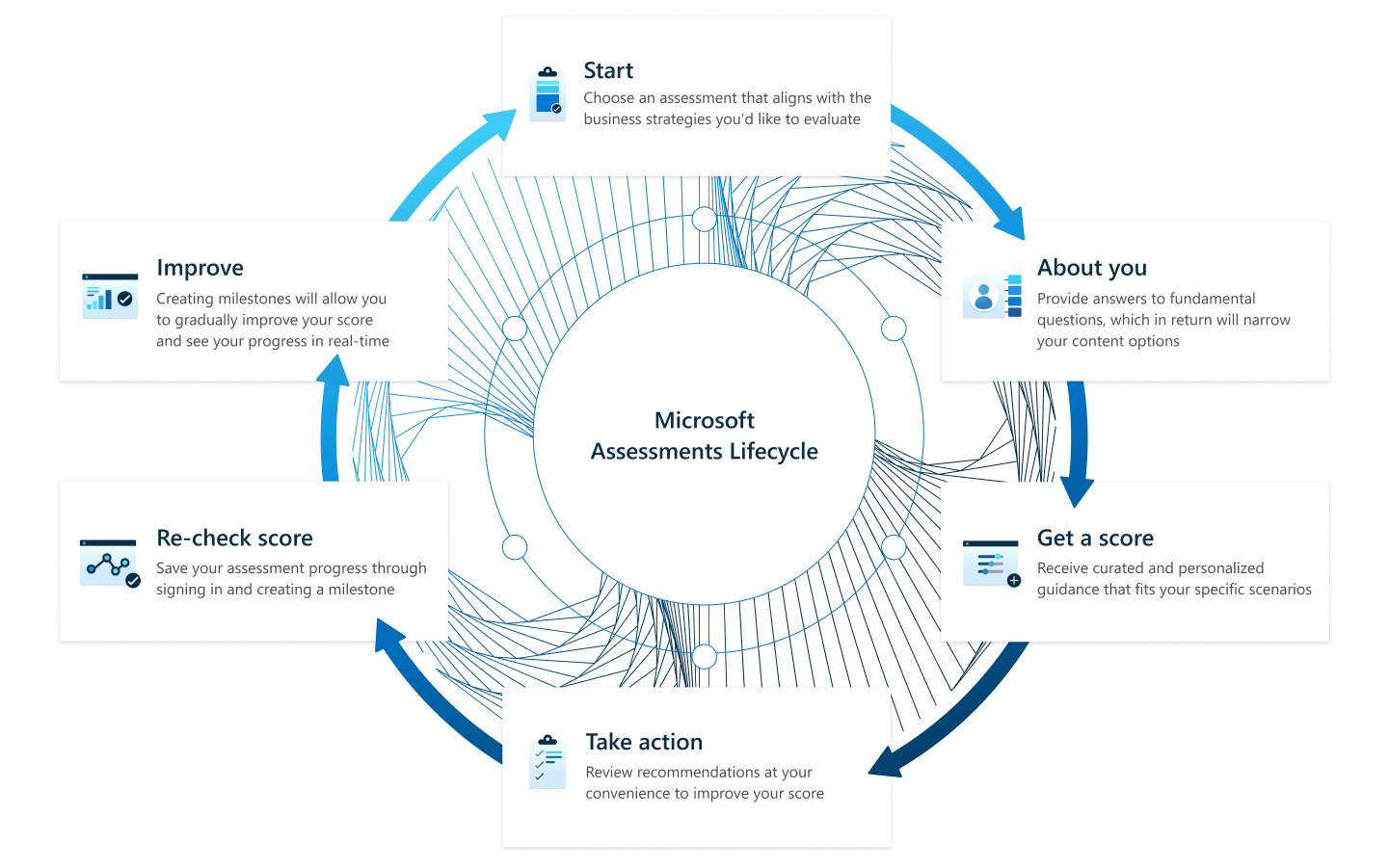
Design feedback was to change the icons, they had similar shapes and the Learn brand colors had been decided on recently.
The gradient fade and outline icons were designed to have distinctive shapes to differentiate them from each other.
The gradient fade and outline icons were designed to have distinctive shapes to differentiate them from each other.
With glyph / icon design I will generally create several different designs quickly, then choose and refine the strongest or most conhesive version with the set.
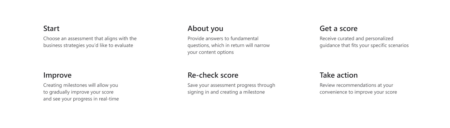
Icon finals with comparison to initial designs. The meaning has been visually simplified.
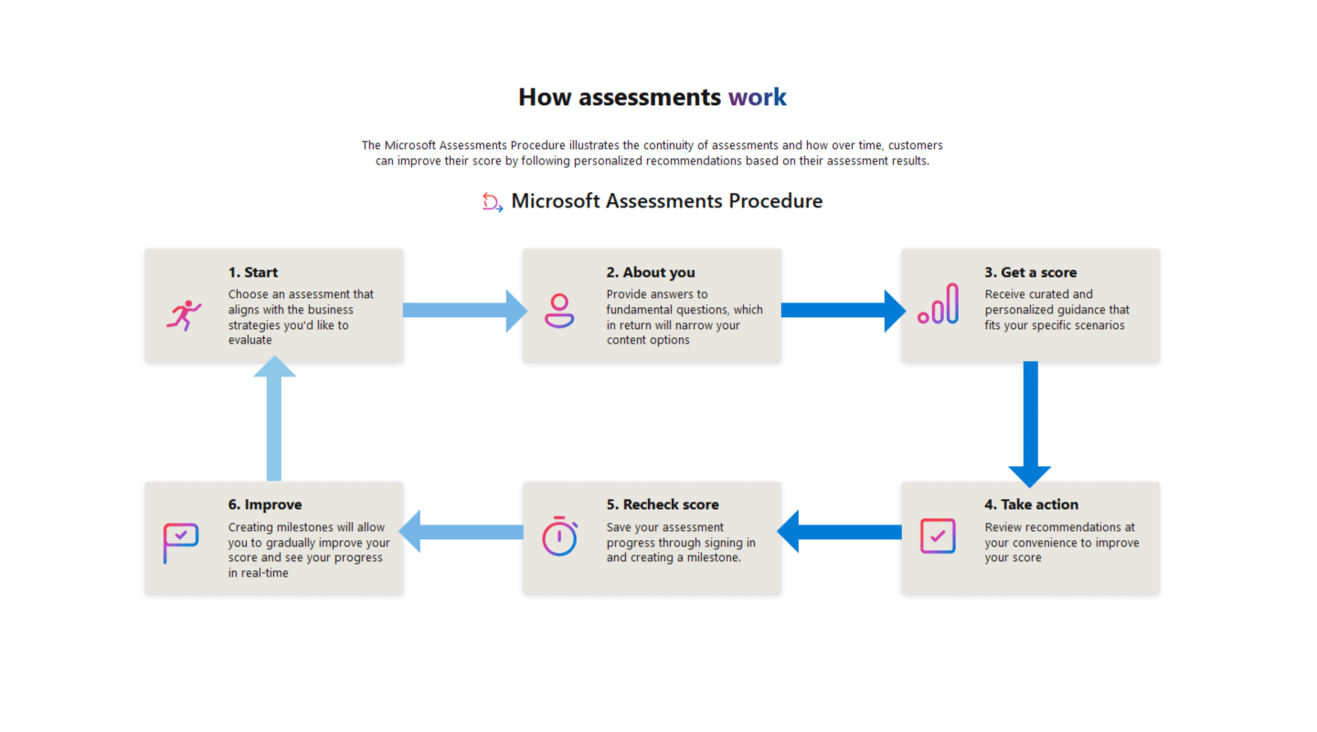
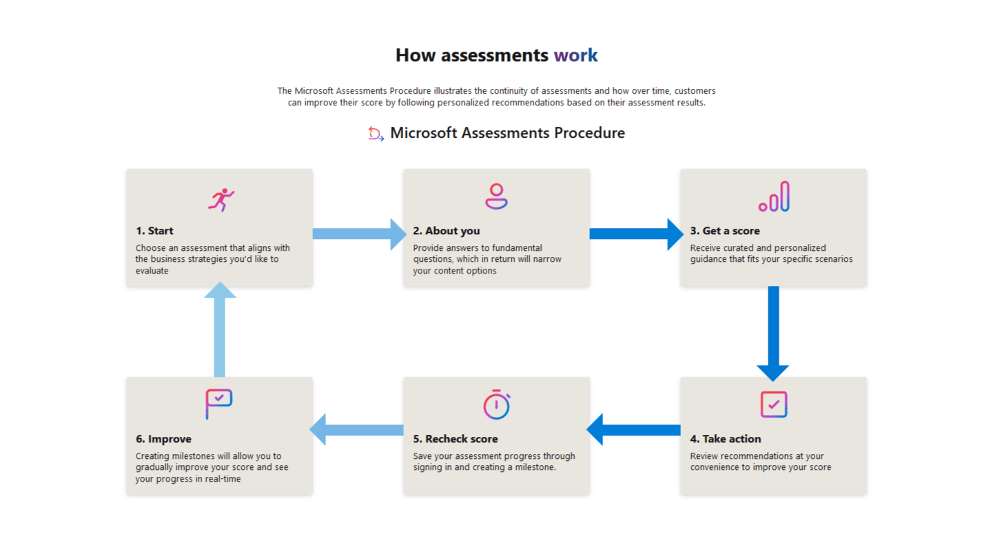
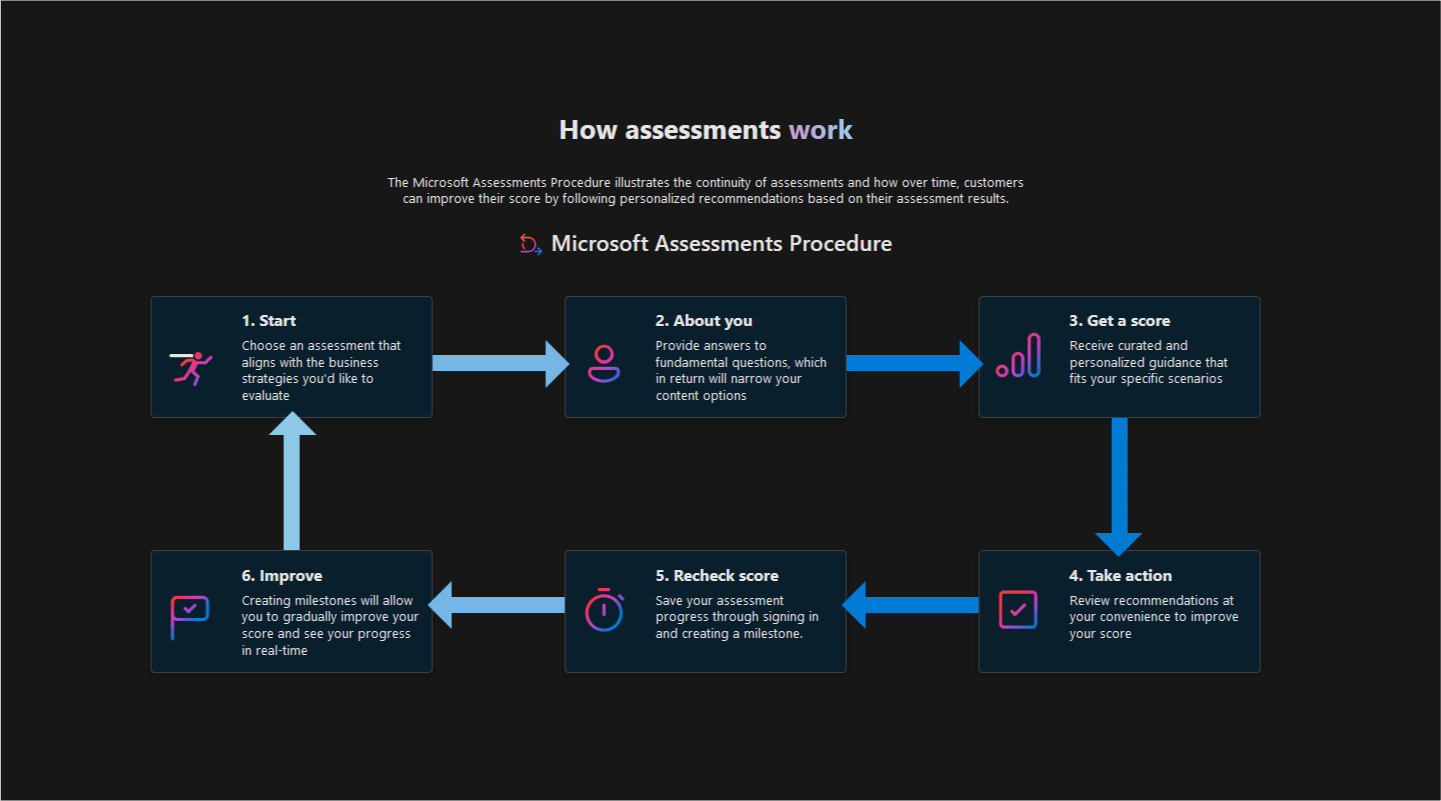
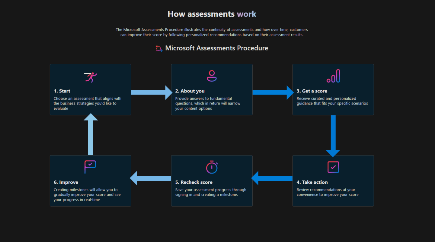
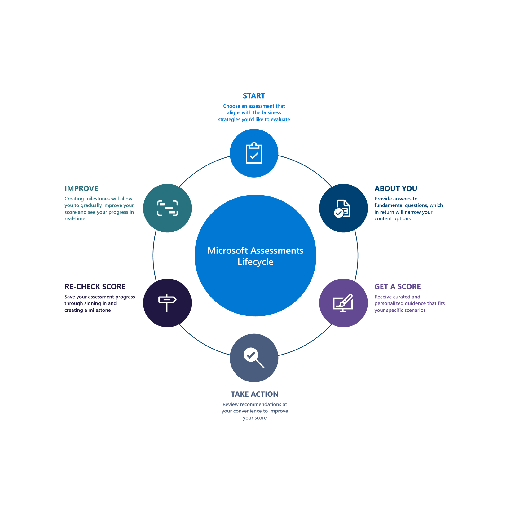
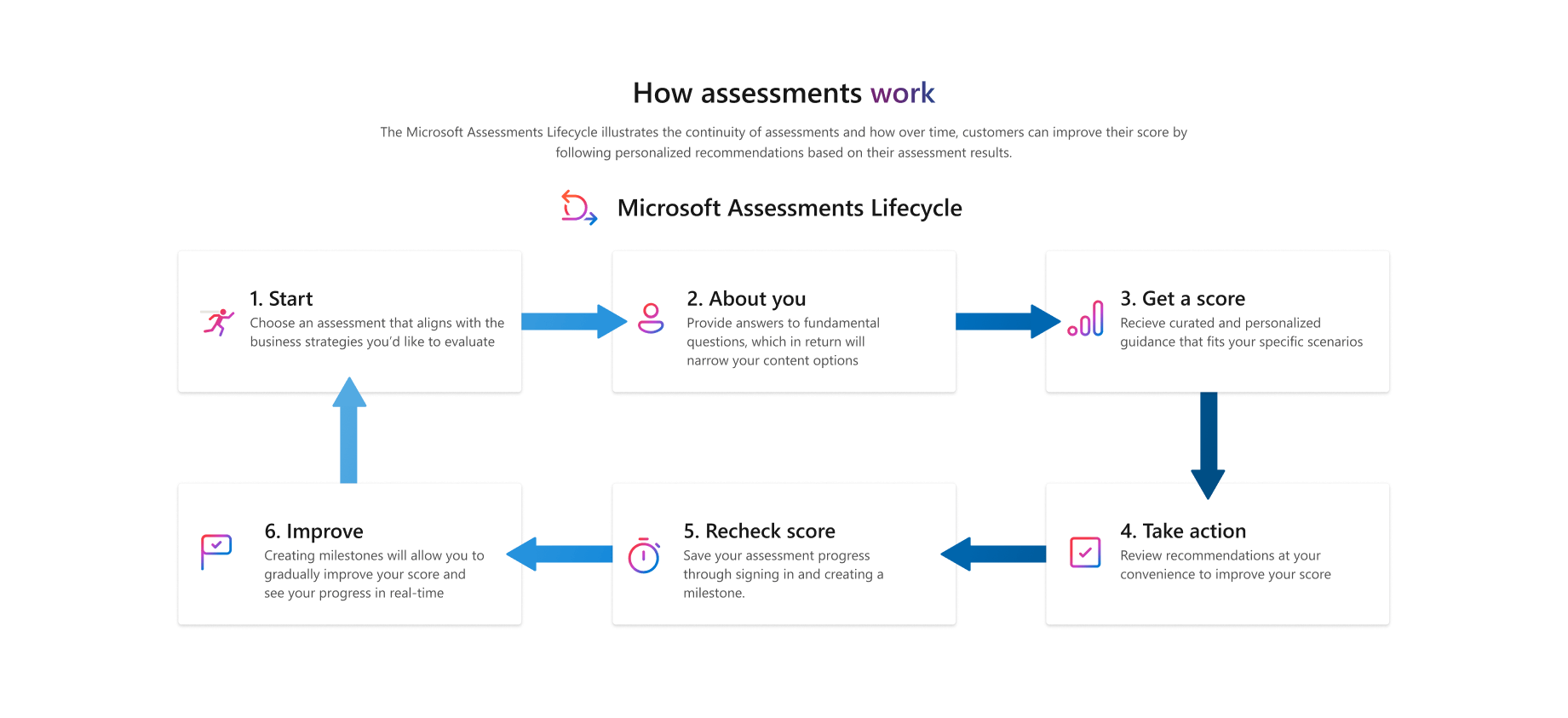
Final diagram:
_desktop mode
_mobile view
_desktop mode
_mobile view
Learn color themes:
_light mode
_dark mode
_high contrast
_light mode
_dark mode
_high contrast